


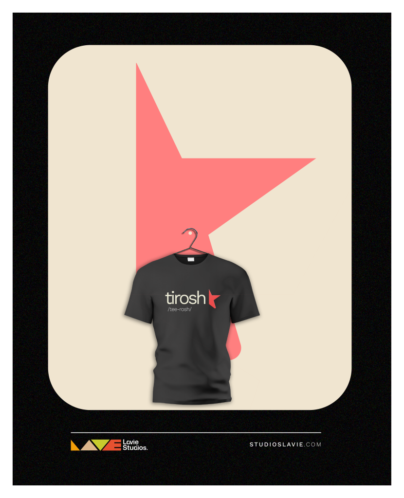
Every great brand starts with a spark. For Tirosh (/tee-rosh/), that spark evolved into a “Creative Explorer”, a community/laboratory designed for diverse ideas to be birthed and breathe.
When the Lavie Studios team set out to craft this identity, our goal was to create a visual system that is both functional and memorable, and we designed a symbol of evolution.
The Evolution of the Logomark
Our design process followed a deliberate path to ensure the final result felt both organic and structured:
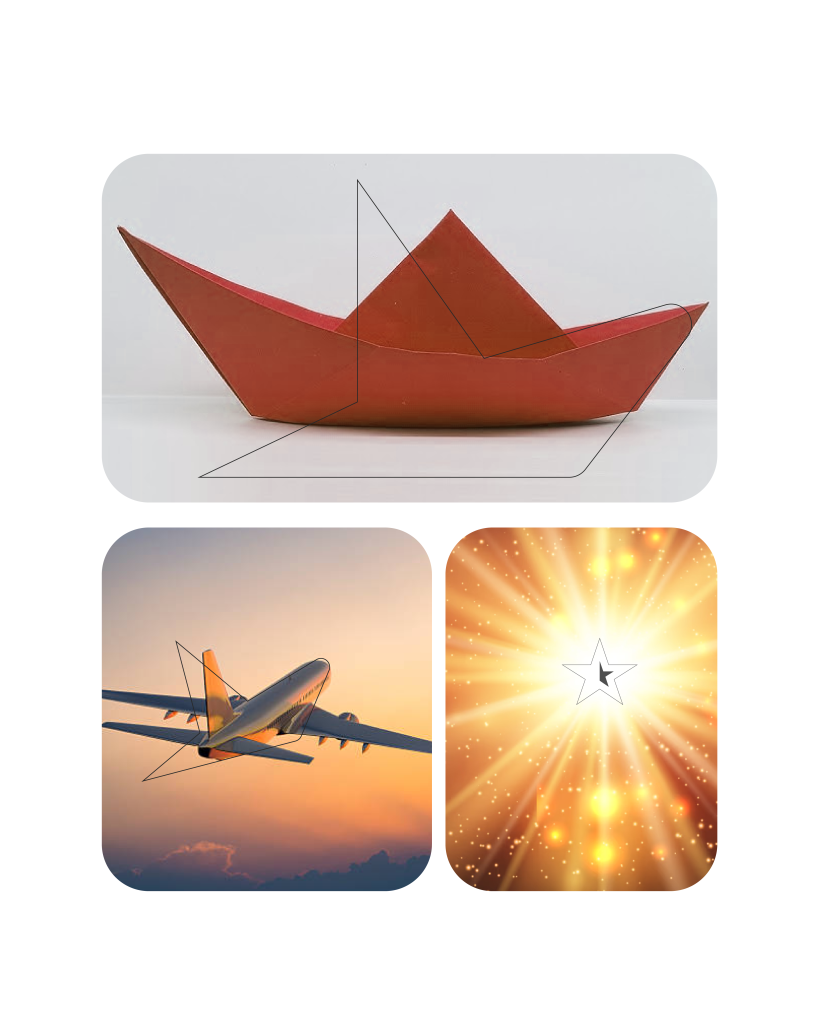
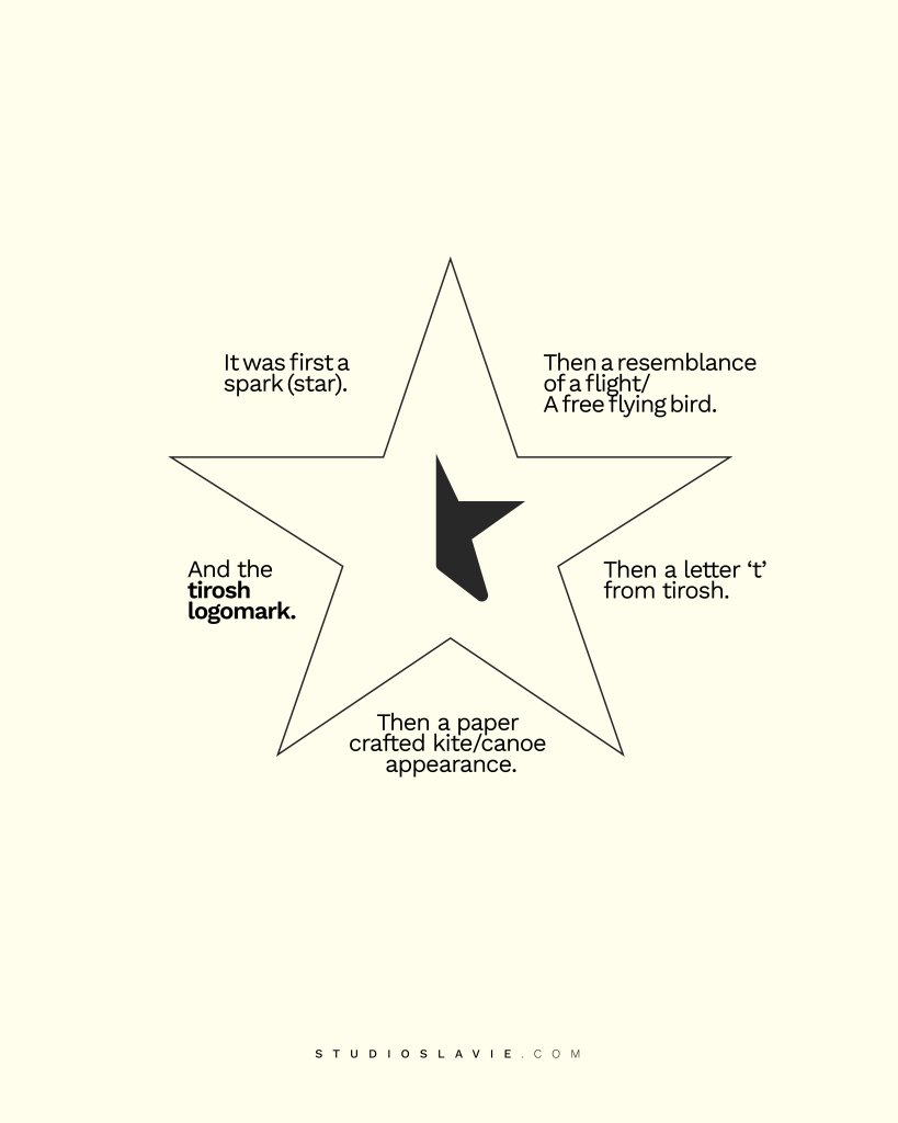
The Spark: It began as a star, representing the initial flash of an idea.
The Flight: It evolved into the resemblance of a free-flying bird, symbolizing creative freedom. The Vessel: It adopted a paper-crafted kite and canoe appearance to represent the journey of exploration.
The Identity culminated in a sharp, functional letter ‘t’ that anchors the Tirosh brand.
FUNCTIONAL IDENTITY FOR A COLLABORATIVE WORLD
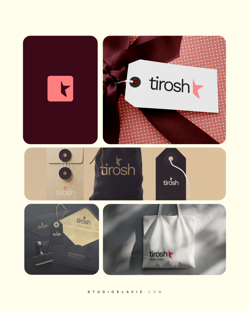
Tirosh is built to be an open-source and collaborative ecosystem. To support this, we developed a visual system that maintains its integrity across every touchpoint, from digital platforms to physical assets, such as tote bags, stationery, and apparel.
By integrating abstract inspiration with geometric precision, we ensured the brand remains recognizable and effective in any environment.
Is your brand ready for its next evolution? We are here to help you build an identity that is both deeply connected to your story and highly effective in your industry.
Book a clarity session with us today:
WhatsApp/Call: +234 (0) 707 3725 374